Navigating the
RingCX
admin interface
=======================================================================================================
You can use the
RingCX
Admin interface to handle a variety of user management and platform setup tasks. Different admin tasks require access to different areas of the interface and different levels of permissions. When you sign in to
RingCX
the system determines what areas you can access and what tasks you can perform in the interface.
Getting started
---------------
To access the Admin interface, [sign in to RingCX](https://support.ringcentral.com/article-v2/Signing-in-to-the-RingCX-Admin-interface.html?brand=RingCentral&product=RingCX&language=en_US "") with your admin account.
### Home page
When you first sign in, you'll see the Admin home page with two sections:
* **Quick links** : Use the links in this section for direct access to the main parts of the platform, grouped by functional area. Links to the same functional areas are also available in the left [navigation bar](#navigation-bar "").
* **Help \& tutorials**: Select any tile to view the relevant support documentation for the admin interface. Depending on the size of your browser window, you may need to scroll down to view this section.
To return to the home page, click the
RingCX
logo at the top left on any page in the interface.

Admin layout and key elements
-----------------------------
How the interface looks and what specific settings it offers vary for each functional area; however, the layout, main elements, and navigation are consistent across the interface.
Familiarize yourself with the main sections of the interface and their functions:
* [Top bar](#top-bar "") (A)
* [Navigation bar](#navigation-bar "") (B)
* [Left panel](#left-panel "") (C)
* [Main panel](#main-panel "") (displays a [group page](#viewing-managing-groups "") or a configuration [settings page](#viewing-managing-settings "")) (D)
* [Footer bar](https://support.ringcentral.com/article-v2/Navigating-the-RingCX-admin-interface.html?brand=RingCentral&product=RingCX&language=en_US#GUID-ba59439c-99ca-4d37-82cd-5107ce19f761-en_us_footer "") (E)
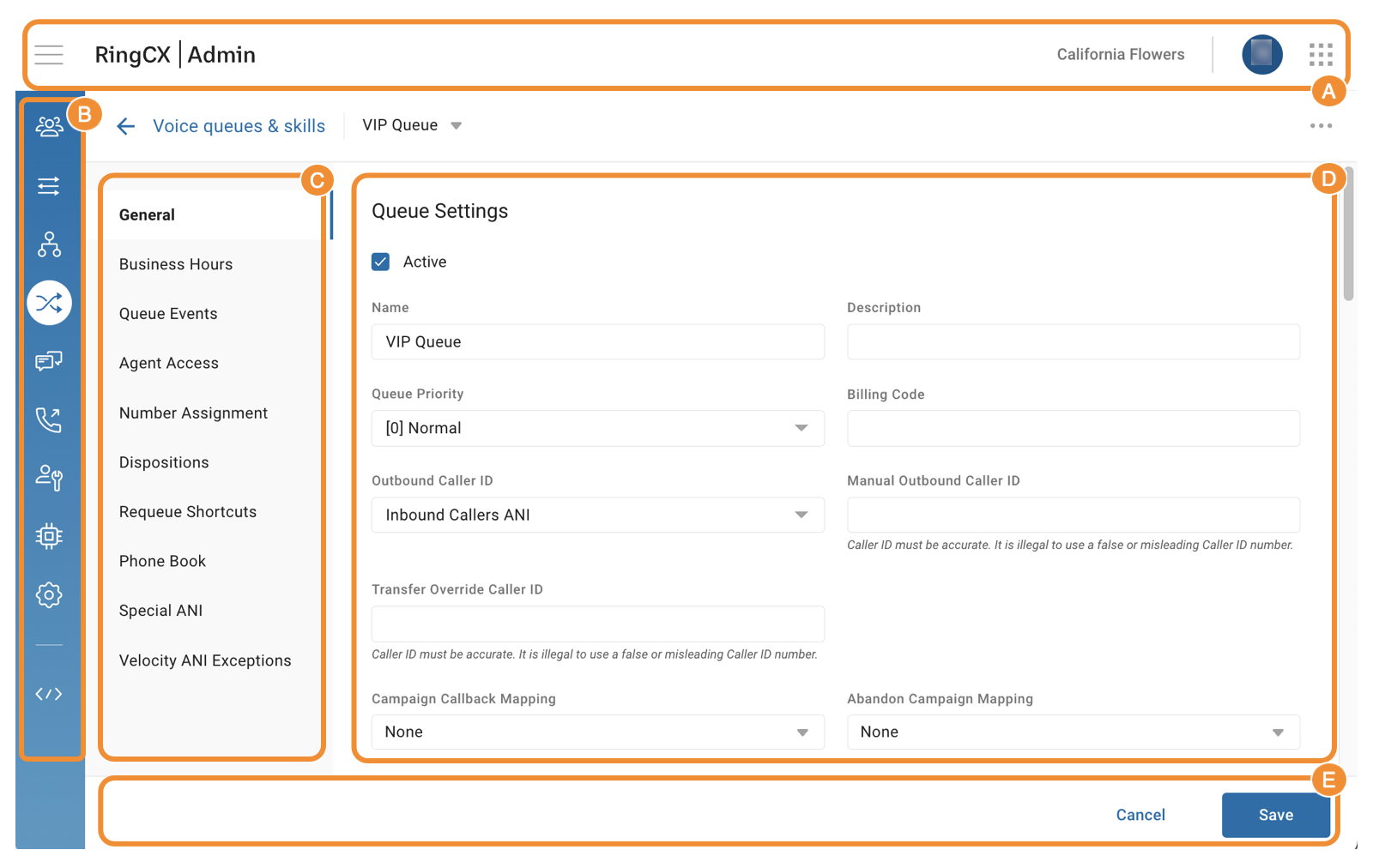
### Top bar
From the header bar at the top of any page, you'll have access to:
* **Menu icon** : Click the **Menu** icon to expand the sidebar showing the functional area names for the icons in the [navigation bar](#navigation-bar ""). Click the **Menu** icon again to hide the sidebar.
* **RingCX logo** : Click the logo to return to the [home page](#home-page "").
* **Account name** : Displays the name of the account you're signed into. If you have access to multiple accounts, click the account name to:
* Display the list of available accounts. Account information includes the name and ID of the account, along with the name and ID of the main account to which this account belongs.
* Switch to another account if you need to.
* **User profile icon**: Click to view your sign-in information, access online help and training, or sign out.
* **App selector** : Click to switch to a different RingCX interface. If you have the necessary permissions, choices include *Admin* , *Agent* , *Analytics* , and *RingSense*.

### Navigation bar
The left navigation bar is visible on all pages.

Use the icons to access these functional areas:
* **Users**: The three-person icon opens Users settings, where you can manage user information and platform permissions for both agents and admins.
* **Channels**: The three multi-directional arrows icon opens Channels settings. Use it to manage phone numbers and set up rules for voice and digital interactions.
* **Categorization**: The flowchart icon opens Categorization settings. Here, you can set up workflows and categories, design cloud and digital routing, and configure track numbers settings.
* **Routing**: The two intersecting arrows icon opens Routing settings. Use it to create queues and skills, define priorities, and assign agents for inbound interactions.
* **Digital**: The double chat bubble icon represents Digital settings, where you can create inboxes, identities, identity tags, and more for digital interactions.
* **Dialing**: The phone icon opens Dialing settings for outbound calls. You can create dial groups and campaigns, add lead lists and do not call lists, and set campaign criteria and schedules.
* **Agent tools**: The person and wrench icon opens the Agent tools settings. Here, you can design agent scripts, create knowledge base articles, add phone book entries, and compose email templates.
* **AI tools**: The microchip icon opens the Artificial Intelligence (AI) tools settings. Use it to set up IVA integrations and define rules for handling sensitive personal identifying information (PII).
* **Settings**: The gear icon opens the platform-level Settings. You can manage your accounts, global and account audio library, call recording delivery configuration, audit logs, and security settings here.
* **Developer tools**: The two caret icons with a backslash open Developer tools. Use this menu to integrate external web services into the platform.
[Intro to RingCX Admin](https://support.ringcentral.com/article-v2/Intro-to-RingCX-Admin.html?brand=RingCentral&product=RingCX&language=en_US "") provides descriptions of these areas in the Admin interface in detail.
### Left panel
Click or hover over any of the icons in the left navigation bar to open a secondary navigation panel. This panel, also called the sliding tray, contains a list of options that varies by functional area.
### Main panel
Depending on which icon and menu option you select, the main panel on the right displays pages of these types:
* [Groups](#viewing-managing-groups "")
* [Configuration settings](#viewing-managing-settings "")
### Footer bar
After you make any changes in the platform, use the buttons located in the footer bar at the bottom of your screen:
* **Save**: Click to save your changes.
* **Cancel**: Click to discard your changes.
* **Save and close:** Allows you to save changes and return to a group or list view. This button is displayed only where relevant.
Viewing and managing groups
---------------------------
A group is essential to organizing various components in nearly all functional areas of the platform. Agents, queues, IVRs, campaigns, and other components are placed into their own groups. Groups help admins to manage similar components more efficiently.
Until you create a group, the group page is empty. Once you've created one or more groups, they appear in a table, listed in alphabetical order. You can click anywhere on the group to expand a list of items added to that group, called group components.

Groups and group components are referenced according to their functional area. For example:
* If you use the**Voice queues and skills group** page in Routing to create groups:
* The groups will contain queues and will be referred to as queue groups.
* The group components will be queues.
* If you use the **Campaigns group** page in Dialing to create groups:
* The groups will contain campaigns and will be referred to as dial groups.
* The group components will be campaigns.
To view and manage groups and group components, you need to have:
* Access to relevant functional areas.
* View, edit, and delete permissions.
### Searching groups
To find a group or one of the group components quickly while on the group page, use filters and the dynamic search bar at the top.

After selecting a filter, start typing in the search bar to see results for the group or component you're looking for.
#### Search bar
The search bar filters your results as you type, responding to alternate spellings, partial entries, and special characters.
#### Filters
If a filter is available to the left of the search bar, select a specific parameter from the dropdown to refine your search.
* For some types of groups, you can filter results by the name of the group, the name of the group component, or the system-assigned ID associated with either. The default option is *All*.
* For some types of groups, you can filter results by account name if you have access to multiple accounts.
### Viewing active and inactive group components
You can also filter groups by the status of group components. By default, all groups are displayed.
From the dropdown to the right of the search bar, select:
* *Active*: To display groups with active group components.
* *Inactive*: To display groups with inactive group components.
For example, if you select the *Active* option while all of the group's components are inactive, the group will be hidden.
#### Active markers
The numbered green and gray ovals, displayed to the right of each group name and called active markers, show how many active and inactive components a group has:
* The number inside green ovals shows how many group components are active.
* The number inside gray ovals shows how many group components are inactive.
When you click a group to expand its components, a colored dot appears to the left of each component name:
* A green dot means the group component is active.
* A gray dot means the group component is inactive.

### Viewing group information
A group page displays the following information:
* The group name
* The number of active and inactive components, as indicated by active markers
* The group components, including whether they're [active or inactive](#group-components "")
* Additional parameters specific to groups in this functional area
Additional parameters include details like Dial Mode for campaigns or Type for categories.

For some types of groups, you need to hover over a group or component for additional details or action icons to appear on the far right in light gray text. For example, the queue group page displays options to configure group skills or add a new queue; however, hovering your mouse over a queue group will not reveal the Caller ID or the number of agents assigned to the queue that belongs to the group.
On the group page, you can also find two icons:
* **Edit group** : A pencil icon to [edit a group](#edit-group "").
* **Add component** : A plus sign icon to [add a component](#add-group-component "").
### Adding a group
To add a group:
* Go to the group page for the relevant functional area.
* Click the **New group** button located at the far right.
* Click the **Edit group** (pencil) icon to access and change settings for the new group.
* Click **Save**.
### Editing a group
To make changes to an existing group:
* Go to the group page for the relevant functional area.
* Click the **Edit group** (pencil) icon for the group you'd like to edit.
* Use different tabs in the group's **Settings** to change values for the group as needed.
* Click **Save**.
### Adding a group component
To add a component to an existing group:
* Go to the group page for the relevant functional area.
* Click the **Add component** (plus sign) icon at the far right from the group where you'd like to add a new component.
* Enter a **Name** for the component and any other settings required for group components in this functional area.
* Click **Save**.
* Set values on any additional tabs in the component's **Settings** as needed.
### Editing a group component
To edit a group component:
* Go to the group page for the relevant functional area.
* Click a particular group to expand the list of its components.
* Click the component you'd like to edit.
* Use different tabs in the component's **Settings** to change values for the component as needed.
* Click **Save**.
* Click **Cancel** or click the group page name in the [group header](#group-header "") to return to the group page.
### Deleting a group
To delete a group:
* Go to the group page for the relevant functional area.
* Select the group you'd like to delete.
* Click the **Edit group** (pencil) icon to access **Settings** for the group.
* Click the three-dot **More** icon and select *Delete*.
* Click the **Delete** button to confirm.
### Deleting a group component
To delete a group component:
* Go to the group page for the relevant functional area.
* Click a particular group to expand the list of its components.
* Click the component you'd like to delete to access its **Settings**.
* Click the three-dot **More** icon and select *Delete*.
* Click the **Delete** button to confirm.
### Performing a bulk edit
To edit multiple group components at once:
* Go to the group page for the relevant functional area.
* Click a particular group to expand the list of its components.
* Hover over any group components and check the box to the left of each component you'd like to edit. To select all components in a group, check the box to the left of the group name.
* Click **Edit** in the bottom right corner to open the group components' **Settings** page.
* Use different tabs to change values for the components as needed. The settings that can't be changed in bulk edit mode will be grayed out.
* Click **Save**.
Viewing and managing settings
-----------------------------
You can view and change configuration settings for most components and groups in the platform on their Settings pages.
### Settings page
Settings pages contain settings for specific features and are available at three levels:
* Functional area: Dedicated to non-group-based settings, these pages appear when you select a relevant menu option for that functional area. Examples are the Routing priority page in Routing and the Leads page in Dialing.
* Group: Pages at this level are intended for setting up groups, such as Queue groups in Routing or Dial groups in Dialing.
* Group component: Pages at this level let you create or edit group components. Similar to groups, these pages are labeled differently depending on their functional area. For example, in Routing, group component pages are called queue pages, and in Dialing, they are called campaign pages.
While the contents of a particular **Settings** page depend on the functional area, group type, or component type, these elements are common to most Settings pages:
* [Group header](#group-header "")
* [Left panel](#left-panel-settings "") with Settings tabs
* [Main panel](#main-panel-settings "") with settings
* [More menu](#more-menu "")
* [Save button](#saving-changes "")

### Group header
On a **Settings** page at the group or group component level, a secondary header bar appears below the [top header bar](#top-bar "") for ease of navigation.
* On a group page, use the group header to search and filter groups and group components.
* On a group component page:
* Click the group page name to go back to the group page where the group or component was created.
* Search or select component names from the dropdown to navigate between different components in the group.
### Left panel with Settings tabs
The panel on the left of the **Settings** page typically contains a list of configuration tabs. Each tab includes settings for the same or similar functionality. The number of tabs and their specific names vary by functional area, group type, and component type.
When you change settings on a particular tab, an orange dot appears next to the tab name in the left panel, reminding you to [save your changes](#saving-changes "").
### Main panel with settings fields
Use the fields in the main panel to define various settings for a particular functional component, group, or group component.
### More menu
You can use the three-dot **More** icon in the top right corner of most pages to access a dropdown of available actions. Typical options include:
* *Clone*: Select to copy a group or component.
* *Move*: Select to move a component to a different group.
* *Delete*: Select to remove a group or component.

After selecting an action, follow the prompts that will vary based on your selection. Make the necessary changes and confirm the action.
### Saving changes
After making any changes in the platform, remember to save them. Typically, you need to click the **Save** button in the [footer bar](https://support.ringcentral.com/article-v2/Navigating-the-RingCX-admin-interface.html?brand=RingCentral&product=RingCX&language=en_US#GUID-ba59439c-99ca-4d37-82cd-5107ce19f761-en_us_footer "").