Adoption & Usage: Active User Trend widget
| RingEX
Last updated on September 01, 2021
While the Total Enabled Users and Active Users widgets provide insights about your user base, the Active User Trend widget helps you understand how engaged your active user base is with RingCentral products. Engagement is a result of users realizing value from RingCentral products and consistently using the products.
The Active User Trend widget is available in Adoption and Usage reports, and is present in the Overview, Message, Video, and Phone dashboard pages.
Active User Trend tracks user engagement by measuring the unique number of active users that engage with the product over a specified period. The specific periods tracked are:
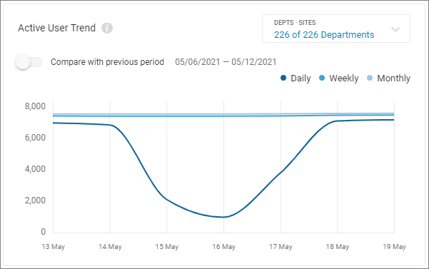
- Daily: Unique users who used the product each day of the selected calendar period.
- Weekly: Unique users who used the product each week of the selected calendar period.
- Monthly: Unique users who used the product each month of the selected calendar period.
The activity measured for each product differs. In the context of RingCentral products, they are:
- Message: A post created in any form using RingCentral Message.
- Video: A video call made or answered using RingCentral Video.
- Phone: A call made or answered using RingCentral Phone.
To sum it up, daily active users for Message are unique users who posted at least one message each day of the selected calendar period. For Phone, daily active users are unique users who made or answered calls each day of the selected calendar period.
The Active User Trend graph shows daily, weekly, and monthly active users for a selected period.
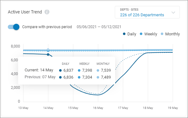
The difference in the level of daily, weekly, and monthly active users with the previous period can be displayed. Toggle the Compare with previous period setting on to enable or disable this feature.

For example: If you selected a calendar time frame of 30 days (i.e., Nov 9th to Dec 9th), the solid lines in the graph show the daily, weekly, and monthly active users within this period. When you toggle the Compare with the previous period setting on, the dotted line will appear. It denotes the Active User Trend for the previous 30 days (that is, Oct 10th to Nov 8th).
You can hover over this graph to see and compare data through this period.
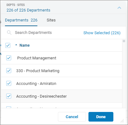
You can select which departments or sites to display by clicking the Dept-Sites filter setting. Filtering by sites is available only when the RingCentral multi-site feature is configured. All departments are displayed by default. You can clear the departments displayed by selecting the checkbox in the Name row. You can use the checkboxes to select or unselect a subset of the available departments, or search for departments by name.
Using the Active User Trend chart
The primary purpose of the Active User Trend graph is to understand the repeat usage of the product. It helps you understand what size of your total user base is continuously using it on a daily, weekly, and monthly basis. Here are some of the scenarios and interpretations on how the graph may appear:
Graphical Scenario
|
Interpretation
|
All 3 lines are close together
|
Your users tend to have very similar usage patterns across the whole organization. Usually, this means your user base is very active (if the number of users is high).
|
All 3 lines are far apart
|
There is a wide variety of user behavior in your organization. This tends to mean only a small fraction are frequent users.
|
Daily and Weekly lines are close together, but Monthly line is much higher
|
You have a small group of users who use RingCentral daily and weekly and a large group that uses RingCentral monthly.
|
Weekly and Monthly lines are close together, but Daily line is much lower
|
Most users use RingCentral at least once a week, but not every day.
|
Daily, Weekly, and Monthly graphs for previous period are much lower than the current period
|
An event in the previous period helped users to better realize the value of the products. This event could be a product or infrastructure update that resolved some issues or an awareness campaign you may have run.
|
Daily, Weekly, Monthly graphs for previous period are much higher than the current period
|
An event in the previous period introduced some issues to users that resulted in them not using the product as much. This event could be a product or infrastructure update or a policy change.
|
Study the usage trend more closely by site or department per product on their respective tabs (Message, Video, Phone) to determine the next set of actions.
© 1999-2022 RingCentral, Inc. Todos los derechos reservados.