Navigating Adoption and Usage analytics
| RingEX
Last updated on September 01, 2021
Adoption & Usage tab
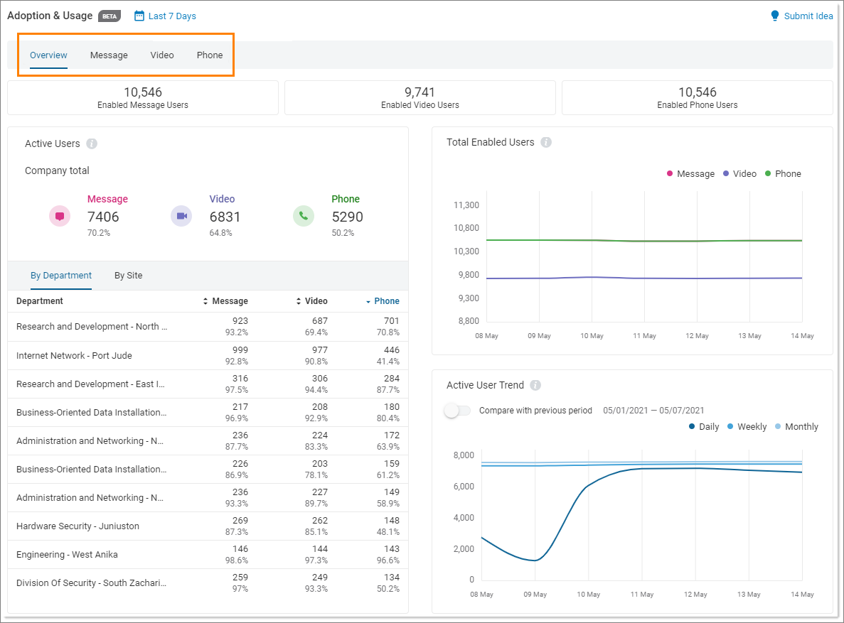
The Adoption & Usage tab is located in the left navigation bar in the Analytics Portal. This tab shows the usage levels and patterns, usage preferences, and adoption patterns for the RingCentral Message, Video, and Phone products.


The main page displays an overview of Adoption and Usage analytics. Clicking on any of the tabs in the top navigation bar opens the following Adoption and Usage report types:
- Overview: The landing page of Adoption & Usage Analytics. It shows the adoption levels of Message, Video, and Phone products and provides collective data on usage across the organization, and at the department or site level.
- Message: Provides the specifics of usage patterns for RingCentral Message.
- Video: Provides the specifics of usage patterns for RingCentral Video.
- Phone: Provides the specifics of usage patterns for RingCentral Phone.
Filters
The Overview, Message, Video, and Phone tabs have the Select KPIs filtering option available beneath the top navigation bar. These context-sensitive drop down fields let you choose how to fine tune the report.

Adoption and Usage widgets
There are a few widgets that are common across the Overview, Message, Video, and Phone pages. The widgets on the Overview page show usage behavior across all products while the other pages provide data specific to one product and different organizational levels.
Each tab is populated with widgets that display information related to a specific category. While some are static, many are interactive. Widgets might show as circles, graphs, or tables.
- Circle widgets: Hover over any segment of the circle to see more information. In some cases, clicking refreshes the User Table for expanded details.

- Graph widgets: When data is displayed in graph format, more details can be seen by hovering over a component. In some widgets, clicking refreshes the User Table for expanded details.

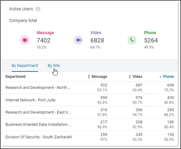
- Table widgets: Some widgets display data in table format. In many cases, you can select from multiple tabs or click on an entry for additional information.
