Navigating Quality of Service: Overview |
RingEX
Last updated on September 01, 2021
This article provides information on navigating analytics Quality of Service (QoS) reports.
Quality of Service tab
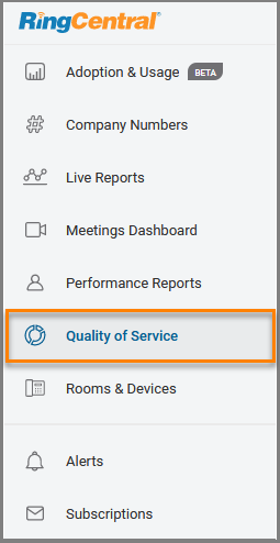
The Quality of Service tab is located in the left navigation bar in the Analytics Portal. Clicking on the tab opens the QoS reports page, where you can view and set filters and widgets on the dashboard to show the information you need.


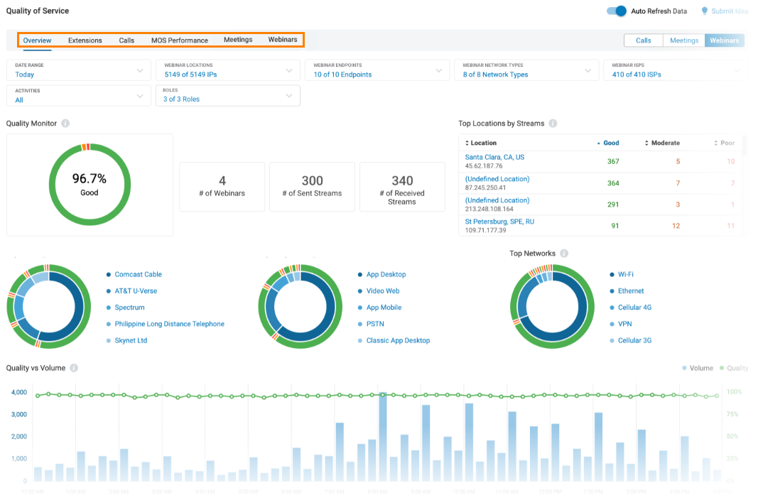
The main page displays an overview of QoS reporting. Clicking on any of the tabs in the top navigation bar opens the following QoS report types:
- Overview: enables you to monitor the health of your company’s phone system and display call usage data. Widgets display near real-time information about multiple attributes that can contribute to a change in call quality.
- Extensions: features QoS analysis by user name or extension. It displays the aggregate data for a specific user allowing for a deeper analysis of the call or meeting quality by leveraging user-specific graphs and trends.
- Calls: lets you view call quality data per call so that you can identify quality issues. It shows a list of call records based on your selected filters.
- MOS Performance: dashboard provides an overview of call quality levels based on the minimum and target Mean Opinion Score (MOS) thresholds for the previous month.
- Meetings: gives an overview of meeting details based on metrics like participants, host, duration and more.
Filters
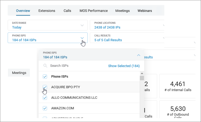
The Overview, Extensions, Calls, MOS Performance, and Meetings tabs have filtering options available beneath the top navigation bar. These context-sensitive drop down fields let you choose how to fine tune the report.

QoS widgets
Each tab is populated with widgets that display information relative to its category. While some are static, many are interactive. Widgets might show as circles, graphs, or tables. Let’s take a closer look.
Circle widgets
Hover over any segment of the circle to see more information. In some cases, clicking opens the Calls tab, where you can view the details.

Graph widgets
When data is displayed in graph format, more details can be seen by hovering over a component. In some widgets, clicking opens the Calls tab for expanded details.

Table widgets
Some widgets display data in table format. In many cases, you can select from multiple tabs or click on an entry for additional information.
